Reverse Engineering the LEGO World Map
In June 2021, the LEGO Group released 31203 World Map, a giant 65cm×104cm mosaic consisting of 1×1 round tiles. LEGO has been creating these mosaic sets for a while now, but usually they’ve just been pop-culture mosaics. So I was very happy to finally see a set related to maps, especially something so visually stunning! I recommend reading the review on brickset.com for more information.
Below is a picture of what it looks like, fully constructed.
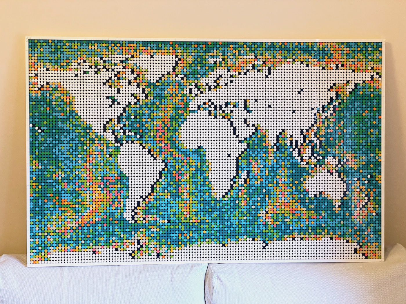
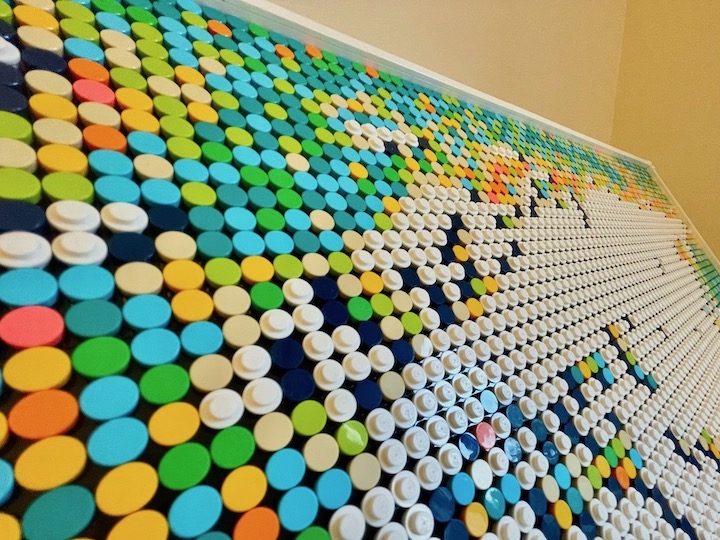
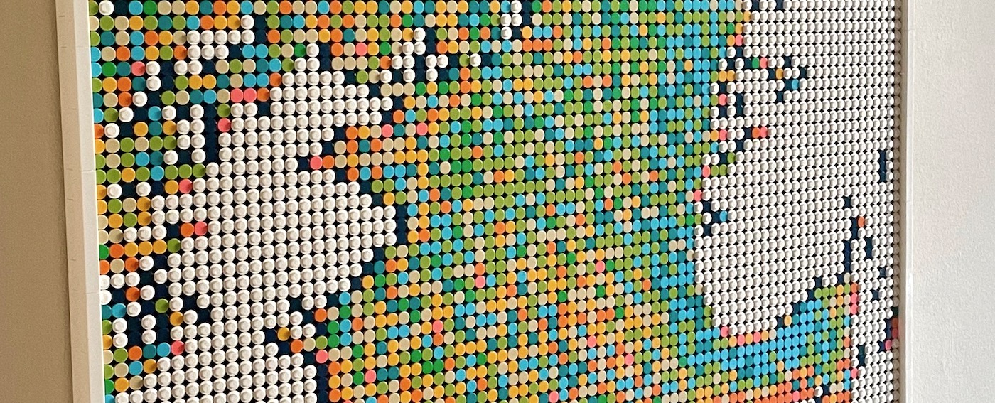
On the face of it, the design seems fairly simple. Land tiles are in white and the bathymetry (sea depth) is represented using several multicoloured tiles. Dark blue tiles act as shadows for the land tiles to make the image pop.
However, as I was constructing it, I did have a few questions.
- How accurate is the land?
- How accurate is the bathymetry?
- How can I make my own maps?
Here’s a sneak peek of the answer to my third question, which you’ll find at the end of this post.
① Land accuracy
In other words, is there a geographic projection that describes the layout of the white tiles?
Sure it looks like a normal world map, but a few interesting design decisions were made:
- Typically the world is centred on the 0° longitude, the Prime Meridian, but in this case the map is centred on Denmark. A reasonable explanation for this is that LEGO wanted to avoid awkwardly chopping the Chukchi Peninsula in two, since it happens to passthrough the Anti-Meridian. But I like to think LEGO just wanted to make Billund, Denmark the centre of the world. 😏🇩🇰
- Antarctica is chopped off from the bottom, and there is a lot more arctic ocean than you typically see in a WGS-84 projection. So the latitudes appear to have shifted in weird ways. It’s not clear why they did this, but I can only guess that not-shifting Antarctica would result in a massive white-tiled area at the bottom of the map that most customers wouldn’t find useful. Additionally, increasing the space for sea-tiles makes the map a lot more colourful! 🌈
The animation below shows the transformations I used to convert a WGS-84 projection to the projection used in the LEGO World Map.
In addition to major shifts and transformations, there are also a few other niche design decisions. For instance, Hawaii appears twice as large, the British Isles are larger than usual, and the Gulf of Mexico was made smaller. You can see a comparison of the actual LEGO tiles with my attempted projection below. Click here to view it in full screen.
② Bathymetric accuracy
I also wondered if there was a correlation between the tile colours and the sea depth.
Below is a comparison of the LEGO tiles and a grayscale image of the sea depth, projected using my custom algorithm I made above. (Full screen)
You’ll see some correlation along the mid-ocean ridges, though there are some spots that don’t quite match up. For example, a few ridges don’t appear, like the one between Africa and Antarctica (Southwest Indian Ridge), between Australia/Antarctica/New Zealand (Southeast Indian Ridge), and the Central Indian Ridge.
Next I wondered if there was any direct correlation between the tile colours and exact bathymetry. Below I’ve graphed the proportional frequency of each colour at a particular depth.

The graph shows a general correlation, but it’s not as if the colours have been placed according to an exact formula. Orange, Yellow, and Beige tiles are more common close to sea-level, whereas Cyan, Teal, and Green tiles are more common below 3,500m.
So while it appears that the LEGO designers used the bathymetry as an inspiration, it’s not a strict correlation to any real data. It’s probably better that way for artistic reasons anyway.
In fact, one of the designers left a personal easter egg in the North Pacific using a few green tiles to represent the Chinese character “李”, which is Li, a common Chinese Surname.
③ Creating my own maps!
So LEGO’s World Map is fairly clever, and I appreciate the efforts they made to make something that looks beautiful on a wall. However the World Map is quite impersonal for my taste. I’m not a world traveller, and I’m unlikely to visit that many places around the globe. I would rather want something that’s closer to home.
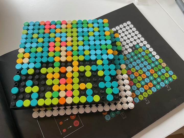
Creating a custom map by hand is actually pretty hard! Visually approximating where the land tiles should go is tricky. I also wanted something that could generate a map for me automatically. So I set out to write some python scripts!
Step 1: Generating the land
This first step is to convert coastline data into a 1-bit image. I couldn’t find any obvious algorithms to achieve this, but I tried out a few image-processing functions to check whether the results looked good. Below are demonstrations of various algorithms I used. (Full screen)
Neither the threshold filter, nor a dithering filter, produced very good results. Small islands end up disappearing, and coastlines end up being frayed.
I ended up creating my own custom filter, which is essentially a kernel filter. It uses the neighbouring cells to determine whether there is enough contrast to turn a pixel “on” or “off”. There probably is an algorithm out there that does something better than my filter, but I found it works for a lot of situations pretty well. At the very least, if you compare my filter’s results to the original LEGO map it’s hard to tell the difference without looking too closely.
Step 2: Generating the bathymetry
The next step is determining how to layout the coloured tiles.
I eventually came up with an algorithm that basically does the reverse of the proportion chart I showed earlier.
Essentially I go though every pixel in a depth map and assign a random tile colour based on probabilities in the proportion chart. In other words, Orange, Yellow, and Beige tiles will appear more often in pixels close to sea-level, whereas Cyan, Teal, and Green tiles will appear more often at pixels with a depth below 3,500m.
It sounds like a basic probabilities problem, but it’s complicated by the fact that we only have a limited number of tiles. So I have to evenly distribute the proportion of colours in such a way that fairly allocates the tiles across all depths evenly. If one doesn’t, the colours might end up being over-used in certain places on the map.
I’ve illustrated the algorithm below.

My algorithm takes in three pieces of data: The bathymetry, the proportions of coloured tiles, and the actual number of tiles I have. Once it has allocated each tile to a depth, they are then randomly distributed back on the bathymetry map according to depth.
The result of this algorithm can be seen below. (Full screen)
I had to adjust the proportions a bit to get the output to properly highlight certain features like the mid-ocean ridges, otherwise the colours would look a bit noisy. But the neat thing about this algorithm is that it’s fairly flexible to my tastes.
I’ll admit, LEGO’s arrangement of tiles still looks better, especially in the Arctic and North Atlantic sea. Then again, they probably didn’t have a computer generate the tiles for them!
Putting it all together…
Now that I’ve created these scripts, I can easily generate more personal maps. Since I live in northern Europe, I decided to make a map of the North Sea. Below you can see the output of each script. (Full screen)
And below is the final result, mounted on a wall.


But why stop there? I’ve also created a few more maps which I think look pretty interesting. It would take a while to create them all by hand, so all I can offer for now is a digital representation.

Conclusion
I’ve published the source code for this project on Codeberg at lego-art-map-generator if you want to check out how the scripts work. But to be honest, the scripts aren’t that easy or intuitive to use… To get good results you do have to tweak the parameters to account for the fact that one has a limited number of tiles in each colour!
But overall I’m quite happy with the results I’ve come up with. And I hope to make it an annual thing where I’ll create a new mosaic using the scripts I’ve made.
Final notes:
The source code for the projection video earlier in this post can be found on Codeberg at lego-art-map-blog-post.
During this project I also came across a bunch of other creative designs and remixes of the World Map set. It’s not quite in the same style as the official LEGO World Map build that I was trying to recreate, but they look great as well!
- Sea temperature world map (Peirce quincuncial) by @williamscraigm
- Sea temperature world map (Equal Earth) by @mapsoverlord
- Height map of Japan (In 3D!) by @nagkaz
- Height map of British Isles + Bathymetry World map (Spilhaus Projection) by @kennethfield
- Height map of USA by u/Amag140696
- Height map of the World by u/Arithmetic_Mustard
- Internet Speed data of Europe by u/db0ze
- Bionicle/Mata Nui map by @PrinceGalidor