Cantographs
What would it look like if song lyrics were positioned and stretched on a timeline based on the audio’s timestamp and duration? I was curious, so I created a visualisation for a couple of songs to see what it looks like.
Below is a simple example of the simple tune Daisy Bell, digitally recreated by a DECtalk Speech Synthesizer.
Press the play button and watch the cursor travel from left to right, matching the time to the actual spoken word. As the song plays, notice how some of the words and syllables are elongated or shortened. Each line in the visualisation represents 7.1 seconds, which I setup deliberately so that each line of the song isn’t interrupted, and the rhyme scheme is obvious (“Do”, “You”, and “Two”).
The visualisation is also interactive! While it’s playing, press the words and it will skip the music to that point in time.
That example was pretty basic, and also synthesised. To see what it looks like with a human singer, here’s Tom Lehrer’s The Elements, sung to the tune of Gilbert and Sullivan’s Modern Major-General’s Song.
There’s not much rhyming, but you can literally see how Tom Lehrer manages to shrink some very complex words into a short amount of time. But unlike the previous song, this song doesn’t have a clear timing-structure.
So to see a visualisation with more structure, we should look for a more conventional song featuring verses and chorus. Next is Jonathan Coulton’s Artificial Heart:
In this example I’ve highlighted the verses in yellow and the chorus sections in red. This song is notable for featuring two tempos, which produces a strange visualisation. You’ll notice that the first and second verses are aligned, whereas the other sections are not. I setup the visualisation to display each line as 5.95 seconds long, so the moment the chorus comes in at a higher tempo, the text no longer aligns.
Next, a song by David Byrne, which features sustained vocals, especially at the end.
Next, Machine Love by Jamie Paige, which is lyrically dense and includes some Japanese lyrics.
With this song, I represented background vocals as lines underneath the primary text. The text in Japanese I coloured differently to make it stand out.
I wish I could use more well known songs, but that would require a license for both the song recording and the song composition/lyrics. I’m grateful that the artists above have shared their work in the creative commons. But I hope these examples are a good sample of what various songs would look like when visualised this way.
But if you’re wanting more, here’s 5 more songs.
- Now Get Ready by Beastie Boys
- Licensed under CC NC-SAMPLING+ 1.0
- Available on Free Music Archive
- Oslodum by Gilberto Gil
- Licensed under CC SAMPLING+ 1.0
- Available on Free Music Archive
- Get Scrappy! by The Crystal Furs
- Licensed under CC BY-NC 3.0
- Available on Bandcamp
- Taken For A Ride by TomboFry
- Used with permission
- Available on Bandcamp
- misaki nakahara by kinoue64
- Licensed under CC BY-NC 3.0
- Available on Bandcamp
Click the images below to view/listen to them.


Inspiration
I was inspired to create these visualisations because of two things I discovered in 2025.[1]
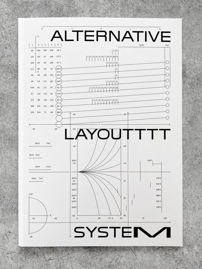
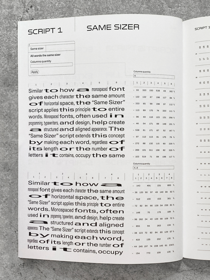
The front page and an excerpt from the Alternative Layout System book.
First I came across the Alternative Layout System by Giliane Cachin and INT studio, which explores different ways to handle typographical problems like hyphenation in latin script.[2] I was particularly inspired by “Same Sizer” and “Ext. Word & Letter”. For example, “Same Sizer” puts each word into a grid, and stretches the word to fit within each grid cell.
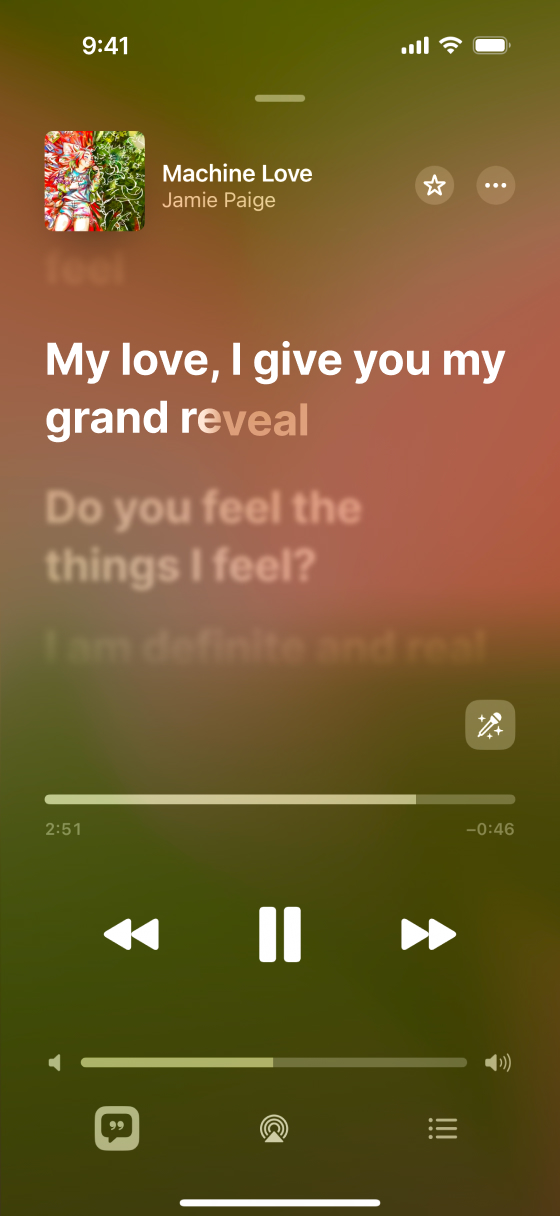
Apple Music on iPhone, showing timed-text lyrics for the song Machine Love by Jamie Paige.[3] The text lights up in sync with the song, like in this example with the word "reveal", which the singer takes 3 seconds to sing.
Secondly, I came across Apple’s technical documentation on how they encode timed-lyrics data. This is used for a feature in Apple Music, as shown in the screenshot above. Apple’s format is based on the W3C spec called Timed Text Markup language, or TTML. The format is relatively easy to parse, where sections of the song are annotated with Apple’s song-part attribute (i.e. Verse/Chorus/Intro/Outro), each line is attributed to an agent (i.e. one or more singers), and each phrase, word, or syllable is given a begin or end attribute to indicate how long the sound lasts.
<div itunes:song-part="Chorus">
  ...
  <p ttm:agent="v1">
    <span begin="03:04.834" end="03:05.191">My</span>
    <span begin="03:05.191" end="03:05.531">love,</span>
    <span begin="03:05.871" end="03:06.220">I</span>
    <span begin="03:06.220" end="03:06.469">give</span>
    <span begin="03:06.469" end="03:06.921">you</span>
    <span begin="03:06.921" end="03:07.208">my</span>
    <span begin="03:07.208" end="03:07.610">grand</span>
    <span begin="03:07.610" end="03:07.959">re</span><span
          begin="03:07.959" end="03:10.763">veal</span>
  </p>
  ...
</div>
Other formats for timed text exist; There are plenty of formats for karaoke or subtitling systems. But TTML is easily extendable, which is very handy for my purposes.
I extended the TTML format with my own attributes, which is how I’m able to customise the colours and – importantly – the length and offset of each line in the visualisation. See the example below of the latter.
<body
  dur="02:33.379"
  lg:wrap-duration="5.95"
  lg:offset-duration="2.6"
>
  ...
</body>
To see a full example, see the TTML file for Machine Love.
Prior Art
I’ve not seen anyone implement something specifically like this before, so I don’t know if this concept already has a name.[4]
So I’ve decided to call these visual displays cantographs. I believe the term was coined by Greta Boesel, an artist who has used melodies and songs to create visual art. I came across her work by searching online for the word “cantograph”, by combining various greek or latin words.[5] I really like her rendition of an Icelandic hymn from the 13th century called Heyr himna smiður, which also includes a legend describing her artistic process behind the piece. Her work uses abstract shapes and colours compared to my renditions which is just text and colours, so it’s not quite the same spirit, but I hope it’s reasonable that it falls under the same umbrella of “visual song representation”.
Further Thoughts
There are many ways this concept could be expanded upon, but would require a lot more dedication to implement. Here are some ideas I’ve had:

On the left, a cantograph with differently shaped sections which allows for multiple tempos. Top-right, a sample of different fonts. Bottom-right, the words "Hebrew" (עִברִית) and "Arabic" (العربية) in their respective scripts, notable for being read right-to-left, with some syllables elongated.
Some songs have varying tempos, like Jonathan Coulton’s Artificial Heart. To handle the changes in tempo, the visualisation could be split into sections consisting of lines with varying lengths. That way the blocks of text can be aligned without changing the alignment of the rest of the verses and choruses. The image above on the left shows what that might look like.
All of the examples I’ve shared use the same sans-serif font. I tried other fonts styles like serif and monospace, but found sans-serif to be more legible; With the right font one might get nicer results. I also made the text upper-case, for the same legibility reasons. Variable fonts could be used to stretch the text, instead of my method using the lengthAdjust attribute in SVG.
I was also thinking how my cantograph could be applied to other languages and scripts. Hebrew and Arabic would need to go right-to-left to make sense; Likewise Mongolian script would be vertical. That would be a simple[6] fix for my code to change the rendering of text…


Illustrations used in the cantograph for Gilberto Gil's Oslodum. On the left, an homage to Rubem Valentim art showing Xangô's axe and Thor's hammer. On the right, Scandinavian imagery.
The visualisations don’t have to just be text. An artist could embed illustrations within the visualisation. I’ve tried this already with Gilberto Gil’s song Oslodum, which is about Gil visiting the city Oslo, Norway. Paying homage to another Afro-Brazilian artist that I like, Rubem Valentim, I used Valentim’s imagery of the Yoruba deity Xangô (Whom Gil likens to the Norse god Thor in the song), along with some Scandinavian imagery of a cod (which Gil mentions in the song), a star (selburose), and a viking ship. I tried to make the overall imagery match Valentim’s geometric shapes, which happens to play well with the design of the cantograph’s rectangular text blocks.[7]
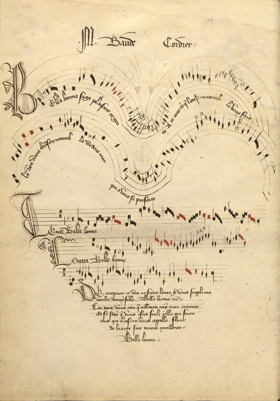
On the left, a video demonstrating a cantograph in the shape of a vinyl record. On the right, Belle, Bonne, Sage, by Baude Cordier.
The lines of text could also be visualised in some other form. In the video above on the left, I tried displaying the lyrics to the song Daisy Bell in a shape of a vinyl record. On the right, is an example of “Eye Music” from the 15th century by Baude Cordier which depicts a heart-shaped staff. Musicologist Jordan Alexander Key created an animation of it being sung.


On the left, a quote[8] formatted in the shape of a heart; Interpreting it as a Cantograph, one would read the text with several long pauses in between. On the right, a visualisation of the song Daisy Bell, where the lyrics are additionally positioned vertically according to the note.
Perhaps the cantograph could even reflect back onto the musician’s songwriting. The musician could deliberately construct imagery which then decides the timing-structure of their song. My example above on the left shows a piece where a singer deliberately spaces their words to form an image in the shape of a heart. This is essentially a form of steganography. It’s probably very uncomfortable to listen to… 😅
Another idea could be adding annotations to indicate the pitch the singer is singing. My example above on the right shows a very basic tune. So I imagine this concept could get very complex for other songs.
Final Thought
I think there are many possibilities with this type of visualisation that could give existing songs a renewed perspective, and allow the listener to see lyrical patterns that otherwise are hidden in sound. Visualising this data is fun! That said, it is an abstract way of interpreting the music; Atomised, robotic, and artificial. The heart is in the music, and it’s what the artist originally intended for the listener.
The source code for my TTML visualiser can be found on Codeberg.
Footnotes
- ^ Actually there was a third thing that inspired me. Earlier in 2025, the YouTuber Matt Parker published a video analysing how some other popular YouTubers will fake the progress bar in the sponsored segments of their videos to retain viewers. Basically, the progress bars would start off progressing fast, but gradually get slower. Then another YouTuber called Noel Friedrich published two videos showing different techniques for speeding and stretching the videos that would "Fix" the issue (Part 1, Part 2). I recommend checking out all three of the links! The whole concept motivated me to do this project, although I had thought about my concept for a long time already.
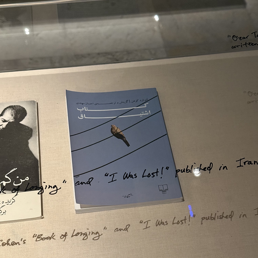
- ^ Speaking of hyphenation, I learned recently that other scripts have features to "stretch" their words to work around this similar issue. While at an exhibition by Michael Rakowitz, specifically his project I’m good at love, I’m good at hate, it’s in between I freeze, I came across a book he had on display by Leonard Cohen titled کتاب اشتیاق (Book of Longing) which features a justified title using the Kashida/Tatweel. Since then I've also learned that some Hebrew text uses a similar style of elongating glyphs in the Torah which Jen Taylor Friedman describes in more detail.
- ^ Machine Love on Apple Music does not actually have any timed text. So this image is actually a mockup I created. I couldn't find any songs with timed text that were actually in the Creative Commons on Apple Music, so I had to fake it.
- ^ I am aware of eye music and graphic notation, but those definitions I think implies an intent by the artist to create a graphical output. All of my visualisations are of songs created by artists that did not have this intention. Plus, I was hoping for a more narrow term than just "graphical music", focusing on the text, not just the musical notes.
- ^ Other terms I came up with were stichograph, tragoúdigram, cantogram (which is unfortunately already a commercial product), audiogram, and many more, but none of the online search results really matched what I was looking for.
-
^ Except for Arabic. In my TTML visualiser the vowels and consonants are broken up into blocks of
<span>elements. That will break the cursiveness of Arabic script. For example, العربية looks very different from ا ل ع ر ب ي ة, despite the fact that it's the same characters, except one has spaces in between, which is what would happen if I added a<span>element against each character. - ^ Valentim's work has important religious and anti-colonial themes. I hope my pastiche of his work is not interpreted as a trivialisation of his work. Instead, like Gilberto Gil's song expresses, I wish it to be an expression of cultural appreciation and exchange.
- ^ The quote is from Chesterfield's Letters to His Son, by the Earl of Chesterfield. I dislike the quote, as it's a very superficial attitude to have. But I also couldn't hesitate the play on words relating to cantographs, which are to a degree superficial! 😅